A strong visual language should be recognizable, but it should never flatten the people it is meant to serve.
At Grainframe, we care about warmth, texture, natural atmosphere, and images that feel close to the actual experience of a place. That does not mean every restaurant, studio, hotel, winery, or maker should be graded the same way.
Why presets flatten brand identity
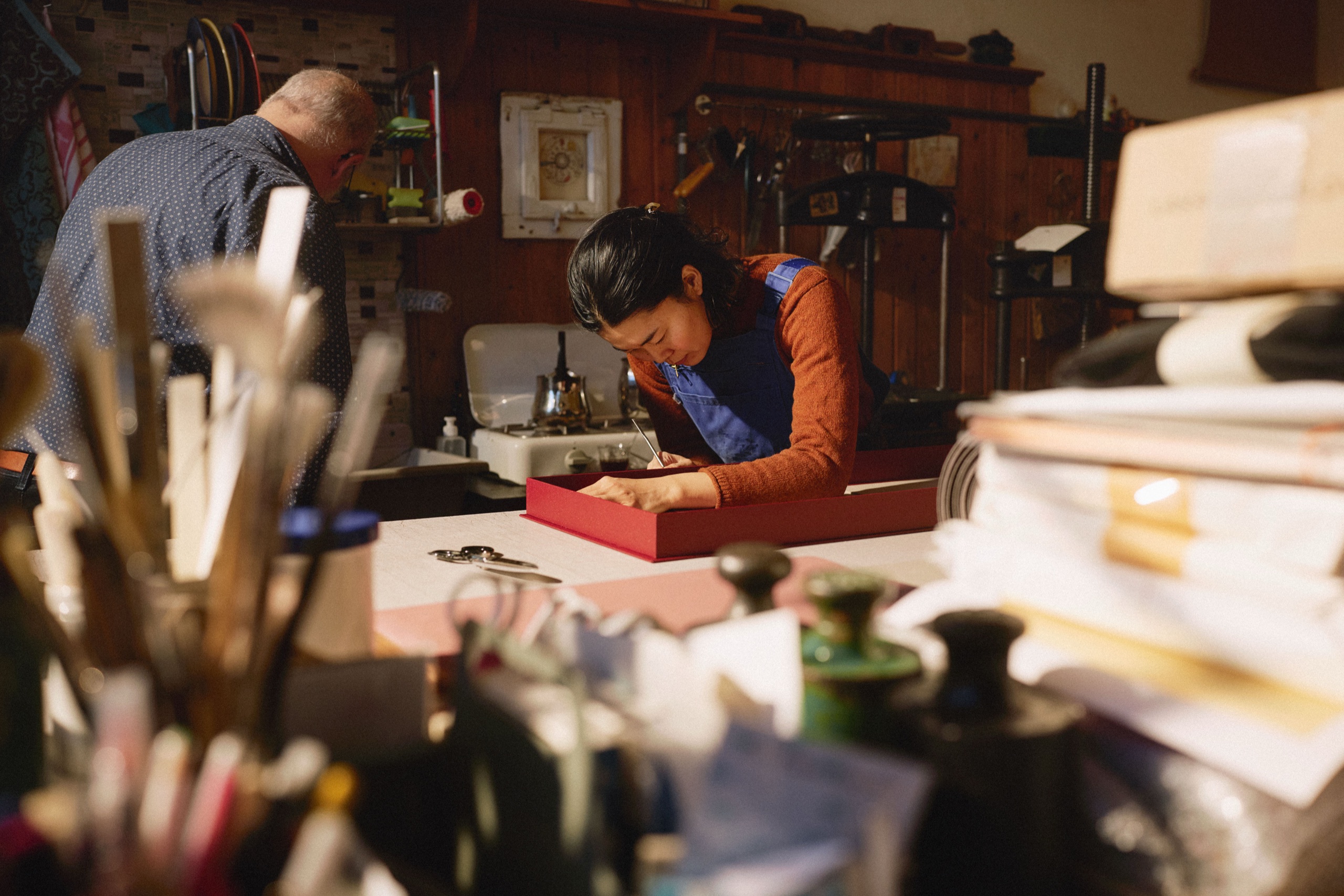
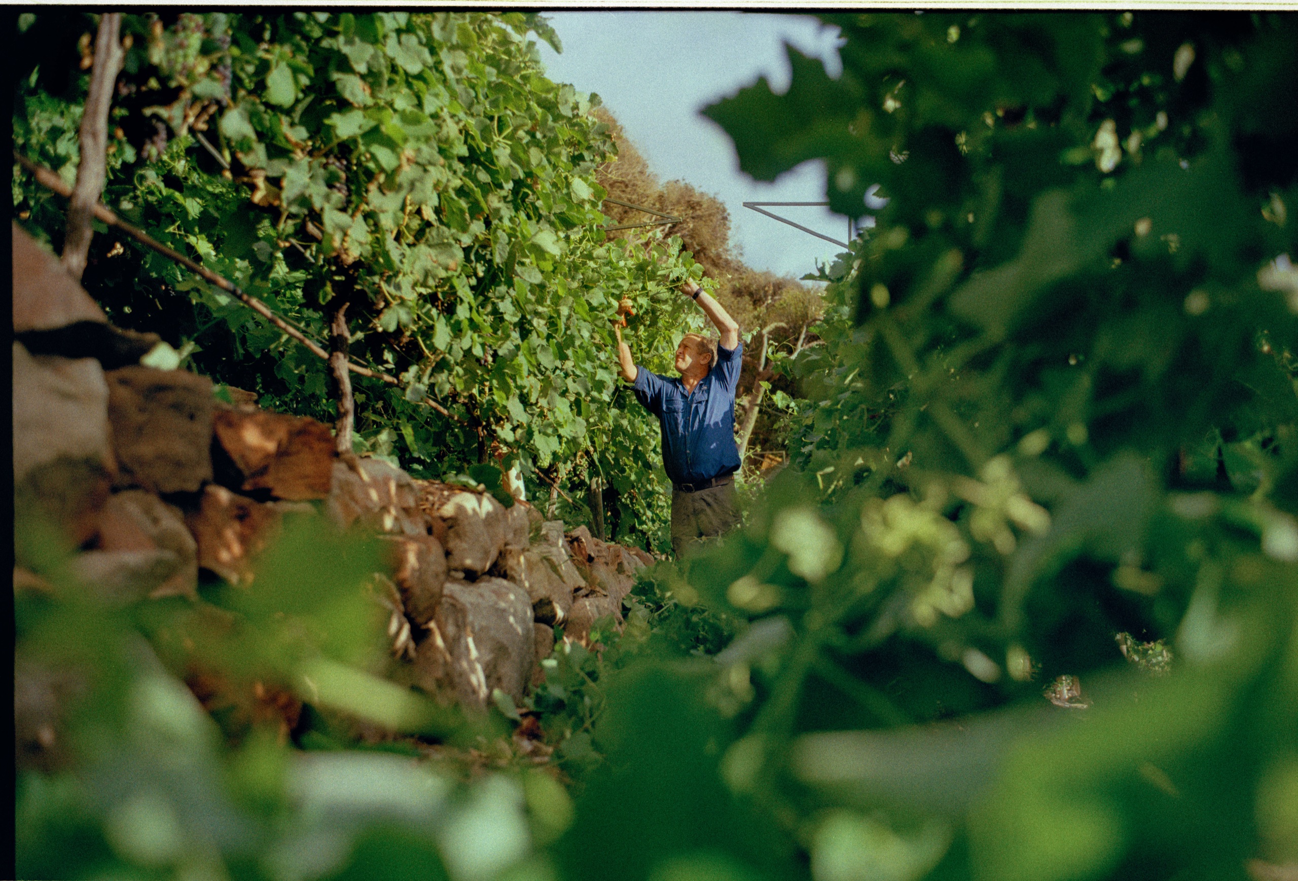
A ceramicist working in a pale, north-facing studio needs different attention than a candlelit wine bar. A seafood restaurant in Brooklyn does not want the same color treatment as a mountain farm, a painter's studio, or a dark hotel lobby. Even two restaurants on the same street can have completely different visual temperatures.

This is why we do not treat color like a preset.
A preset assumes the image should bend toward the same recipe every time. But real places are specific. The wood tone matters. The wall color matters. Skin tone matters. The way daylight hits stainless steel matters. The green in a vineyard is not the same as the green of herbs on a plate. The amber of a bar at night is not the same as the amber of a studio lamp.
Consistency does not mean sameness
Consistency should come from judgment, not automation.
The work should feel like it belongs to the same studio eye, but the final grade should belong to the client. That balance takes time. It requires looking carefully at what the business already is, not forcing it into a style that photographs well for someone else.
Color grading for restaurants, studios, and hotels
For hospitality and craft brands, this matters because images become part of the public memory of the place. They live on websites, in press features, on reservation platforms, in pitch decks, on social feeds, and in the minds of people deciding whether to visit, book, buy, or reach out.
Good color should not call attention to itself. It should make the room feel right, the food feel honest, the material feel touchable, and the person feel human.
How hand-grading protects the feeling of a place
That is the care we are after: a consistent visual language, adjusted by hand for the uniqueness of each client.
A candlelit wine bar in Brooklyn, a daylight artist studio in Queens, and a hotel lobby in Manhattan should not all be forced into the same color recipe. Custom color grading helps each New York City client feel specific while still belonging to a thoughtful hospitality photography practice.